citizenkhan
It Wandered In From the Wastes

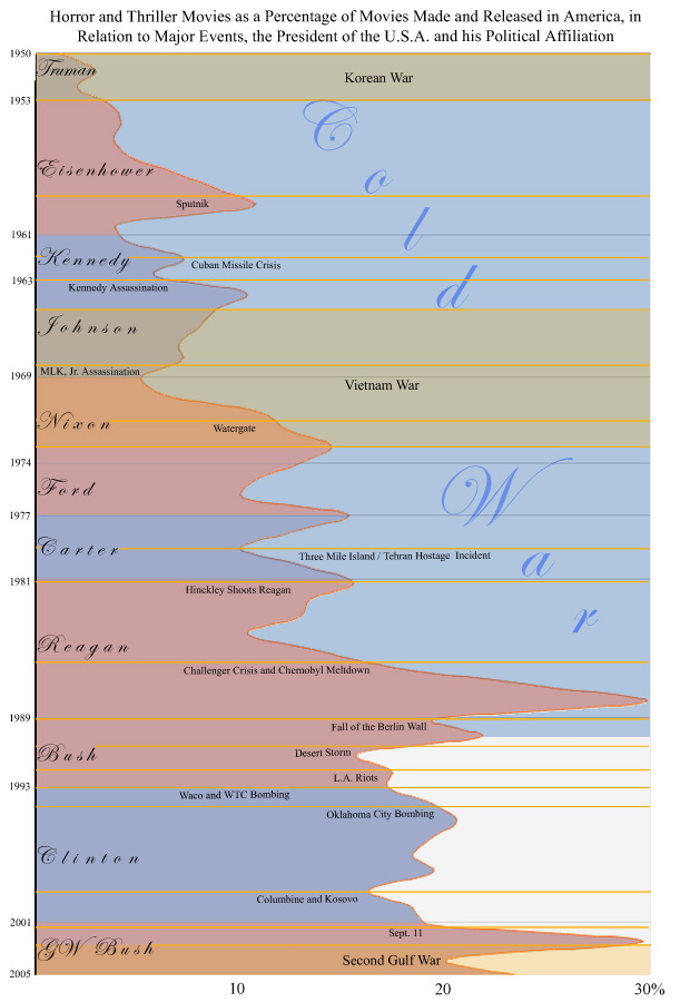
I made this last January for a class on the graphical representation of data. The graph should be self explanatory, since that was the point of the class. What I did was research the percentage of horror/thriller movies released in theatres and make connections to various things.

So, what do you think? Can we actually read something into this?[/img]

So, what do you think? Can we actually read something into this?[/img]


