looks okay !
much better then the first 2 artworks .
much better then the first 2 artworks .


Well, this whole picture just screams Tactics to me.Endless Void said:Well... I actually liked the general feel of this concept art... It's now beginning to feel like Fallout apart from the guys on the picture... They somehow feel like Tactics...
No. There are really to many things on this picture.Endless Void said:And beside the Junktown atmosphere am I the only one feeling that somehow this concept art is overcrowded?
Heh, I wouldn't be suprised if they were painted over a photo.Vault 69er said:About the guys in the pic.. I wouldn't worry about it too much. My theory is that these pics were thrown together a few days before being posted. Maybe a couple of weeks at the most. (To me it looks like they grabbed some of the staff at Bethesda, made them put on some old costumes and took a pic).
I predicted the content of this pic after all, it follows the pattern of direct responses to general fan outcries.
MrBumble said:Not sure if I like it or not. Not sure if it does feel like fallout or not. Don't know. Seems just too realistic and modern for Fallout. AAAAAAAH dammnit...

It's hard to say if Fallout was cartoony because of limited technology (256 colours) or because of stylistics.wamingo said:Still, Fallout is rather cartoony. Compare with stalker for instance.
Can Fallout be captured in a more photorealistic environment?
I don't follow the forums much, so perhaps it's been asked and answered.. If it has just say yes and I'll go hunting instead")

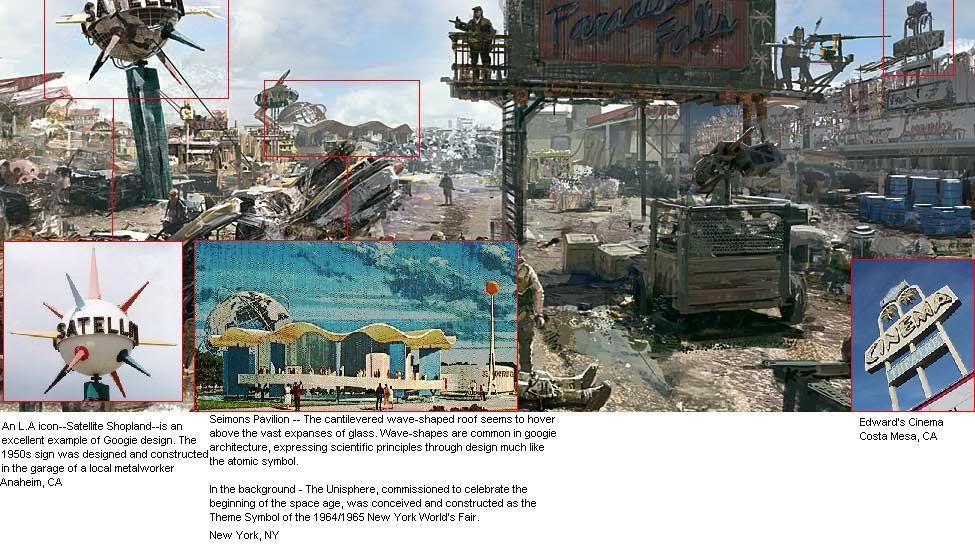
Brother None said:Anyway, some analysis. Please help me expand, people:

Brother None said:Not bad, FeelTheRads. Nice feel. Too bad about the "Brown = real" theme going there.
Anyway, some analysis. Please help me expand, people:
Ja, I'm working on it now.Brother None said:Could you overlay Seimons pavilion/Unisphere too? That seems to be 1:1 too.
FeelTheRads said:Given the fact that is customary to fix stuff Bethesda breaks, I tried it too:
I feel I should move away from the references of past games,
Can I use that for the banner of my blog?
Sorrow said:It's hard to say if Fallout was cartoony because of limited technology (256 colours) or because of stylistics.wamingo said:Still, Fallout is rather cartoony. Compare with stalker for instance.
Can Fallout be captured in a more photorealistic environment?
I don't follow the forums much, so perhaps it's been asked and answered.. If it has just say yes and I'll go hunting instead
Some things like some of character models suggest the first other like Fallout comics and blue cave walls suggest the second.